Anyone involved in marketing knows that powerful lead generation strategies set your business up for higher sales and more revenue.
Lead generation can be done in many ways—email marketing, social media, and of course, website traffic from SEO or PPC campaigns. But that traffic is useless if you can’t convert anyone before they exit the page.
For this reason, one of the most effective (and evergreen) methods that can bring you a constant stream of leads is an effective, high-quality lead generation landing page.
This blog post will cover the following:
- What a lead generation landing page is
- The characteristics of a lead generation landing page
- 8 examples of high-quality lead generation landing pages
What Is a Lead Generation Landing Page?
A lead generation landing page is a web page designed specifically to capture the contact information of potential customers or leads. It is created as part of a marketing campaign to convert website visitors into leads for a business or organization. These landing pages are a sales funnel tactic alongside webinars, emails, surveys, product launches, and others in a broader marketing strategy.
A landing page is focused on one objective: to entice visitors to complete a desired action (subscribe, demo, buy, etc.). It has minimal distractions and a clear call-to-action (CTA) that guides visitors toward that specific action.
Leads are encouraged to take this action by providing their contact details in exchange for something of value. This could be a free e-book, whitepaper, webinar registration, newsletter subscription, or any other type of digital content or offer.
The Characteristics of a Lead Generation Landing Page
Here are six characteristics that make for an effective lead generation landing page.
A valuable content offer.
By offering something of value in exchange for a customer’s details, such as an e-book or a webinar, you increase the likelihood of capturing leads. This allows you to continue the conversation with potential customers and nurture them toward a conversion. It’s important to remember that customers want an offer that is relevant to the ad that they are seeing. So, as an example, if you are trying to bring in leads for your meal prep service, you could offer an eBook with a few free recipes.
Limited information requests.
It’s important to strike a balance between capturing enough information to qualify leads and not overwhelming visitors with too many fields. You can always gather additional details through progressive profiling, where you collect more information over time through subsequent interactions with your leads. By keeping the number of fields to a minimum, you reduce friction and make it easier for visitors to provide their information. Software like Driftrock can help you create simple forms to streamline the lead process for your customers.
Fast loading speed.
A landing page is usually a subdomain of your main website. So make sure your web hosting can handle high volumes of traffic. The last thing you want is for a video to freeze or the site to crash once you launch your campaign.
Many businesses also work with experienced web design agencies like Bizango to create landing pages that balance loading speed, branding, and conversion-focused design.
One clear CTA.
A single CTA eliminates confusion and ensures that visitors understand the primary action you want them to take. When there is only one prominent CTA, it stands out and directs visitors’ attention to the desired conversion goal. This clarity helps increase the chances of visitors following through with the intended action.
Eye-catching copy.
Start with a captivating headline that grabs the reader’s attention. Highlight the main benefit or solution you’re offering to pique their interest. Use persuasive language throughout your copy to convince visitors to take action. Emphasize the benefits they’ll receive, such as saving time, increasing efficiency, or gaining exclusive access to valuable content. Include relevant images, infographics, or videos to support your message and help break up the text.
Easy-to-read text.
Make sure your font choice is easy on the eyes. The color should contrast well with the background. And leave plenty of space at the margins. To be effective for ranking in SEO, you’ll want between 500-1,000 words.
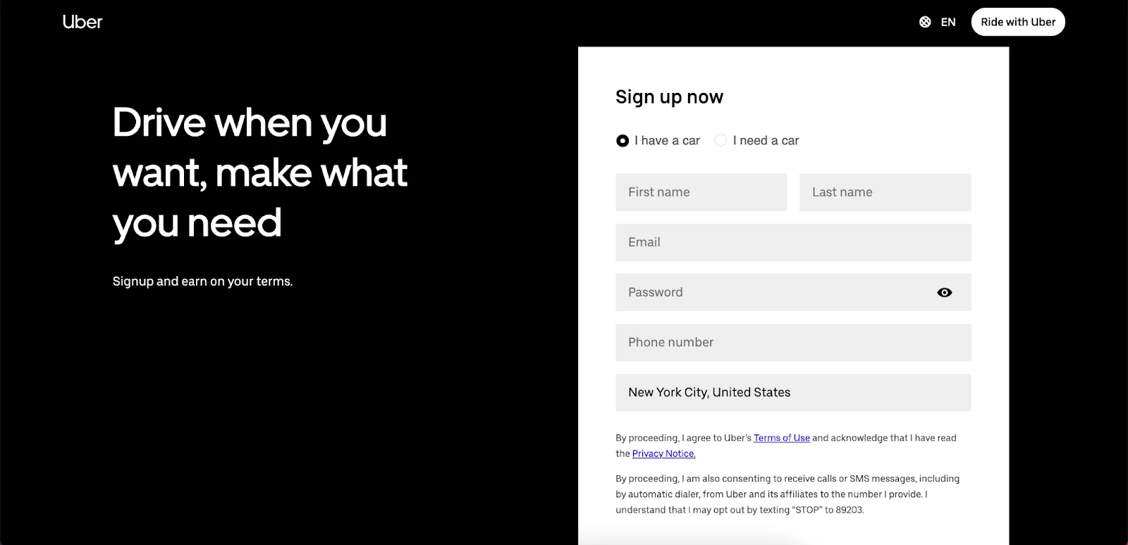
On the other hand, some landing pages are so crisp in every other element, few words are necessary. You’ll need to decide what’s best for you based on your product, industry, social media following, other marketing strategies, etc. Uber is a great example of a simple landing page with minimal text.
By implementing these elements effectively, your lead generation landing page will capture the interest of visitors and motivate them to share their contact information. The generated leads can then be nurtured through follow-up marketing efforts, such as an email campaign, to further engage and convert them into customers.
Now, let’s look at eight quality lead generation landing page examples.
Example #1: Green Chef’s “Pick a Bowl” Offer.
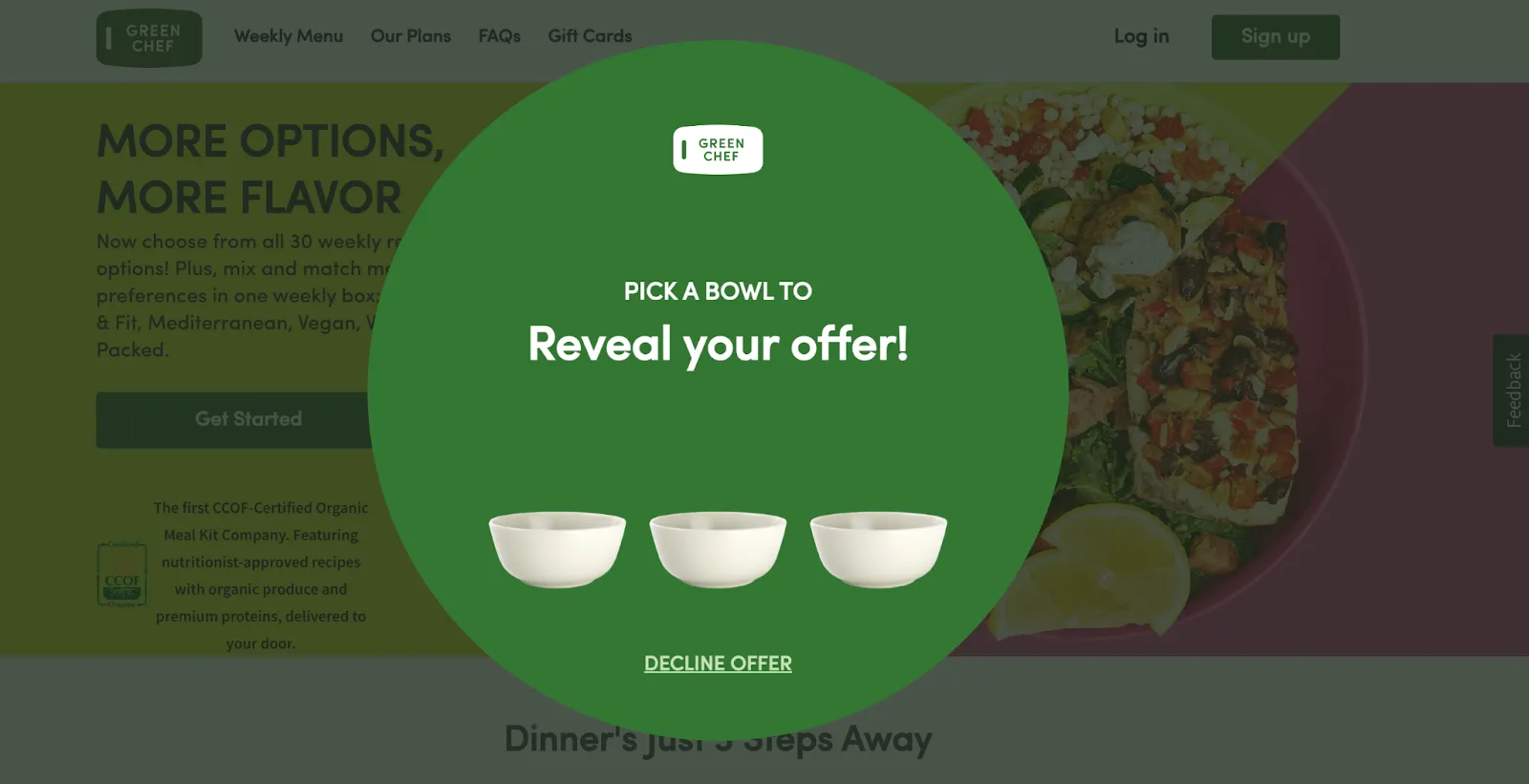
Green Chef is a meal prep and planning service. Their “Pick a Bowl” offer is a fun way to engage customers and offer a promotion. Notice how it doesn’t request any information (that will come later). It’s bold and easy to read. There’s one obvious goal: pick ONE bowl!
If your company is like Green Chef in that it constantly ships products, you can get creative with using a QR code generator to put a QR code on your packaging. Link a QR code to a post-purchase survey landing page to get feedback or to a new product you’re promoting.
Don’t ship anything but have a physical store? Using a QR code is one of the easiest ways to send customers to your various landing pages.
Example #2: Groupon’s 20% Off Signup Discount.
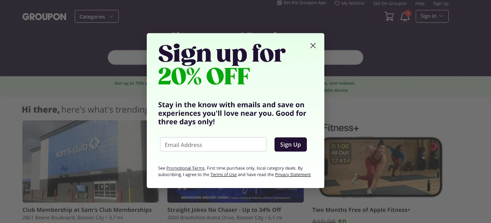
What’s so effective about Groupon’s sign-up landing page is that it’s a basic popup. It almost seems too simple, but that’s why it’s so powerful. The copy is short, sweet, and to the point. There are no visual distractions. And the goal is obvious: subscribe to their email newsletter and get 20% off your purchase.
Groupon also resists asking for too much information. Just an email? That’s easy enough for leads to enter. It streamlines the process to ensure a lead doesn’t feel like Groupon is being invasive.
Using a popup helps you generate interest, instill a sense of urgency, and entice people to subscribe or make a purchase right now. Popups can also be tailored based on specific user behavior or demographics. By using targeting rules, you can display relevant offers to specific segments of your audience, increasing the likelihood of conversion.
Example #3: Travel Like a Bawses’s Free Masterclass on Traveling for $100 or Less.
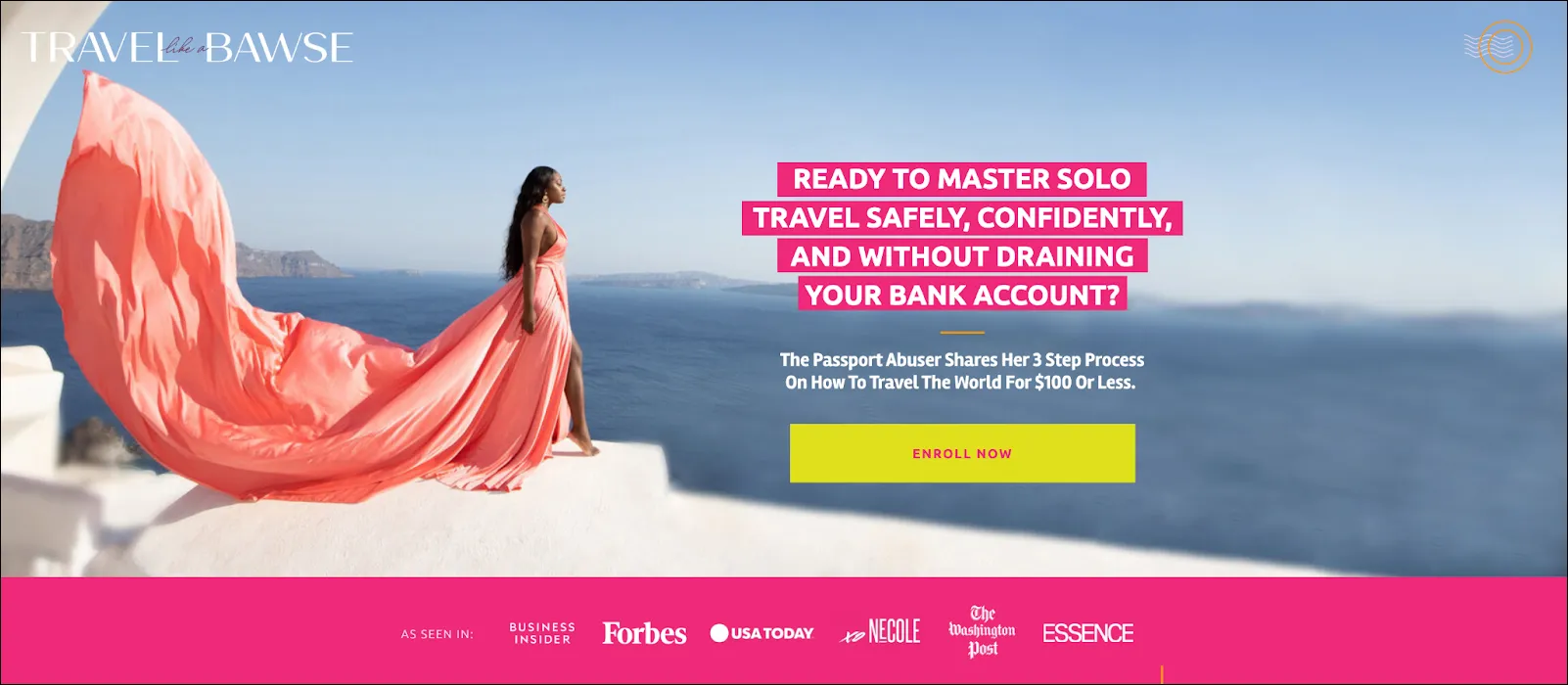
Travel Like a Bawse’s landing page offers a tremendous value proposition with a free masterclass on traveling for $100 or less. That immediately grabs the attention of budget-conscious travelers.
Highlighting this specific benefit (affordable travel) will resonate with the target audience. And by targeting a niche audience, the chances of attracting qualified leads who are genuinely interested in the topic increase.
This page is easily the most visually appealing. Notice how the woman in the photo represents what is verbally on the page. She’s in an exotic location and looks incredibly confident. It connects with the emotional side of the customer’s brain so they think, “I want to look like that, too.”
Including the social proof at the bottom of the page also helps drive conversions. Brands like Forbes and USA Today bring instant credibility. Incorporate this where you can. Even if you’re a small and local company, it can be effective.
Example #4: Girls Gone Strong’s No Obligations Pre-Sale List.
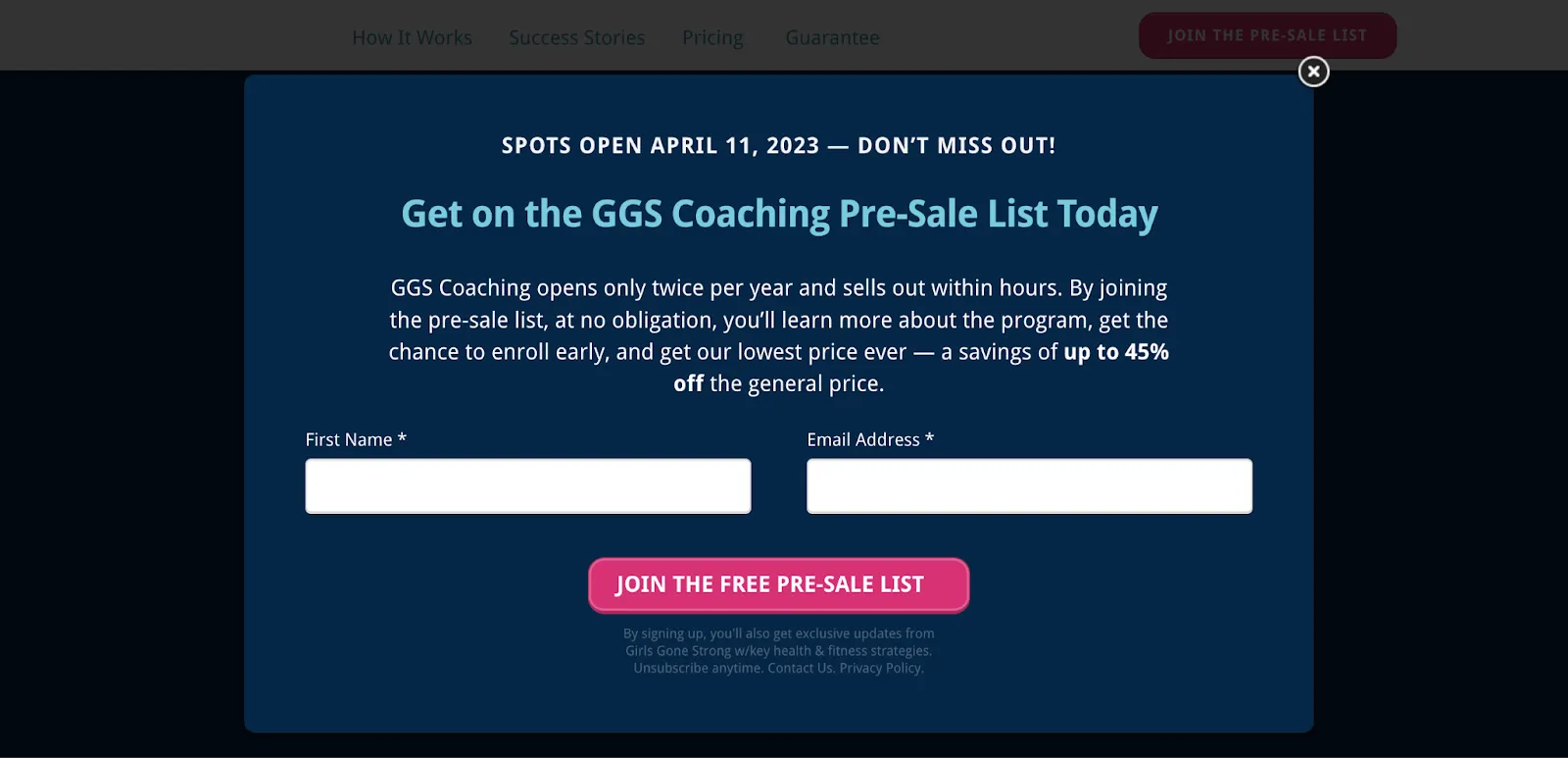
Girls Gone Strong is a nutrition and fitness coaching business and this landing page invites people to sign up. What stands out first about this landing page is its time-sensitive nature. Their coaching opens twice a year and sells out quickly. The catch? There is none–and that’s the best part. There’s no obligation to enroll and for those who sign up, they can get up to 45% off their enrollment fee.
One area where we’d suggest a change would be to add an image. A woman working out or cooking a healthy meal would add a lot emotionally to the page.
On the other hand, the dark box and straightforward copy have a no-nonsense feel to it. Which probably gives visitors a good idea of what it will be like to work with a coach. This is a good reminder to make sure your landing page’s tone, look, and feel match your brand.
Example #5: Notes in Spanish’s “How to Get Fluent in Spanish Fast” PDF Guide.
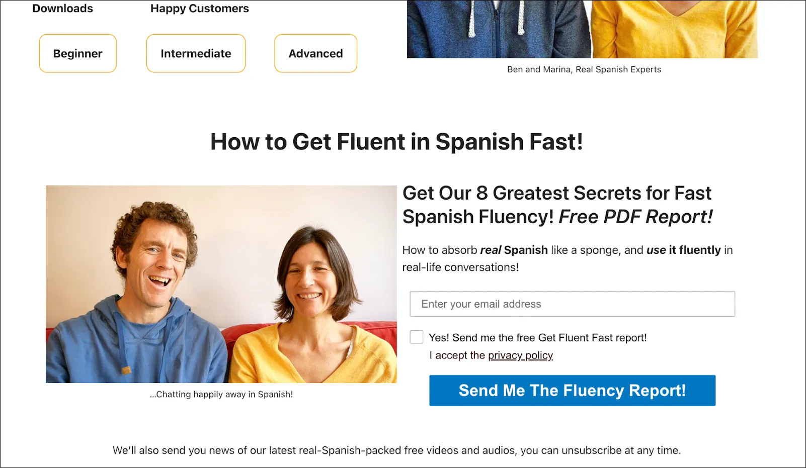
Notes in Spanish is a language instruction site that promises to teach students the real Spanish they’ll never find in a textbook or app. That value proposition is quite the attention grab. Getting the “real” something when you can’t get it anywhere else is very appealing.
They offer a free report in exchange for just an email address. But the note underneath the blue CTA button is important for potential leads. They also regularly send out news about free video and audio to help you learn Spanish.
If you’re a company that offers educational resources, giving away valuable content like a report, the first chapter of a book, or other exclusive material will help leads determine if they want to take the next step and purchase your course, book, masterclass, etc.
Similar to our previous example, this page’s visual aesthetic could use some improvement. It’s a tad text heavy. But for those simply looking for help learning Spanish, it likely won’t be a huge detractor. An advantage of this, however, is that their page load speed is quite fast.
Example #6: Reliable Soft’s Digital Marketing Training.
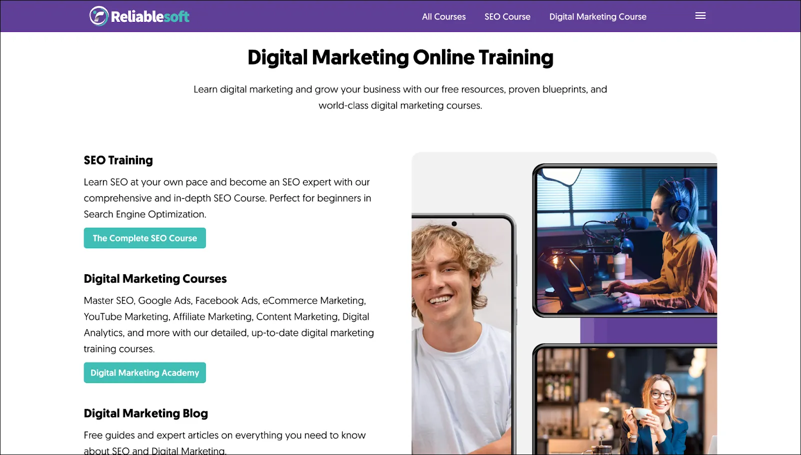
Reliable Soft’s landing page for their digital marketing online training is different than every other example on our list. Its goal is to sell a training course to visitors. It’s also different in that there isn’t one clear CTA. There are multiple!
This could seem like a problem at first. But a lead lands on this page because they’re interested in taking a course. This landing page is designed to help visitors figure out where they should start. The copy describing each option is clear so students know exactly what they get.
Even though there’s more text than in our other examples, there’s plenty of white space with appealing visuals.
Example #7: Marzzacco Niven & Associates Free Case Review.
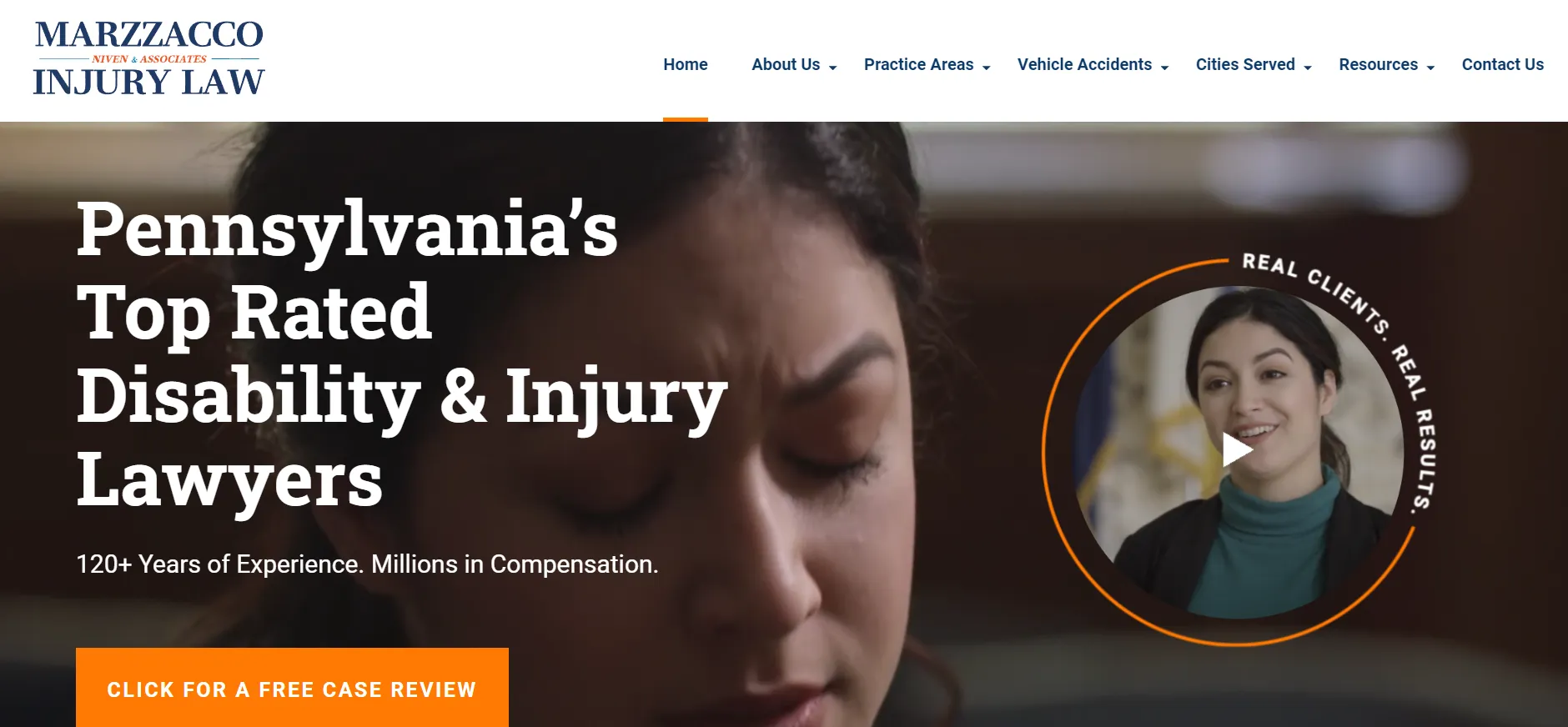
Marzzacco Niven & Associates is a law firm in Pennsylvania. The first thing you’ll notice is that bold, bright orange CTA button: “Click for a Free Case Review.” Talk about a valuable content offer.
But it’s more than that since it’s not technically “content.” It’s copy that tugs at the heartstrings. A fear many people have when debating whether or not to contact an attorney is the financial burden that comes with it. Marzzacco Niven addresses that fear right up front.
You can take this idea no matter what industry you’re in. Think of it like a “Free Demo” in SaaS or “Wear it for a Week” in apparel. If you’re in the healthcare industry, you might consider offering a free consultation on a first visit. This is a no-obligation opportunity that will, when nurtured properly, likely turn a lead into a loyal customer.
Example #8: Nectar’s Employee Recognition Software Demo.
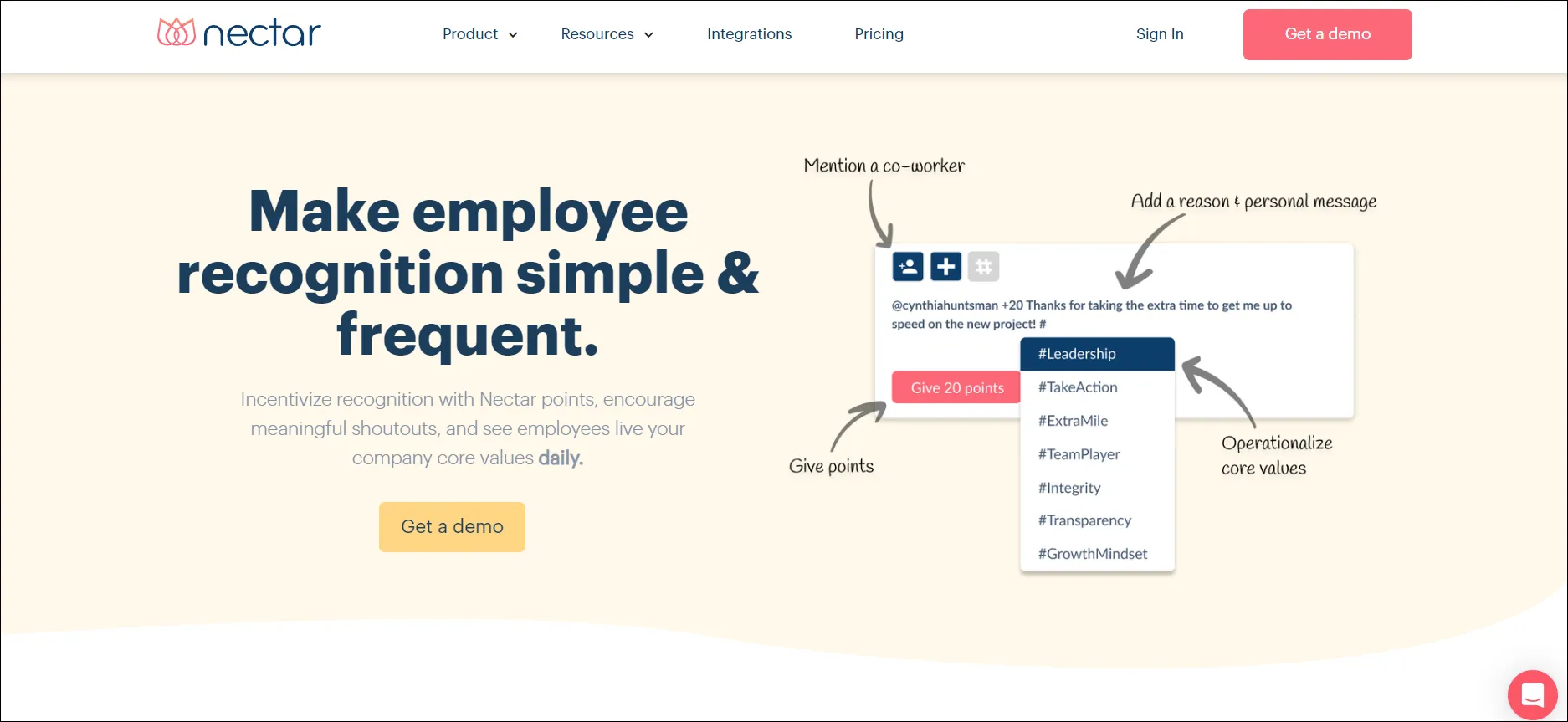
Nectar is a SaaS company that specializes in human resources. One of their products focuses on employee recognition and their landing page for it is nearly flawless. First off, it’s visually pleasing to the eye, with lots of white space, bold fonts, and screenshots of their software. The CTA is obvious: Get a demo.
The bold headline explains the benefit of employee recognition. Only below the fold do they get to the features of what the software does, but it’s incredibly helpful. In three steps, they show how it works. There’s no confusion about what and how the software works. If you’re in SaaS, remember that your customers do not work in software. Put them at ease and show them how your product works (even before the demo!).
Finally, the landing page also cites statistics on why companies need to focus on employee recognition, pointing out, “Lack of recognition is one of the top reported reasons for employee turnover.” That statement creates a sense of urgency for the potential lead. Consider relevant stats on your page so your visitors feel a push to act now, not later.
Final Thoughts on Lead Generation Landing Pages
You can build your own by studying these eight lead generation landing pages.
These brands have done it right–they present their page visitors with a valuable, desirable content offer that makes handing over their information a no-brainer. This is then followed by a clear and concise CTA that tells them exactly how to receive the content offer (i.e. clicking “sign up”).
Successful lead generation landing pages also use persuasive copy–but at the same time, it’s simple and easy to read.
And finally, asking for too much information will turn your potential leads off–whether for privacy reasons or inconvenience. In a nutshell, try to think and feel like a potential customer as you create your page.
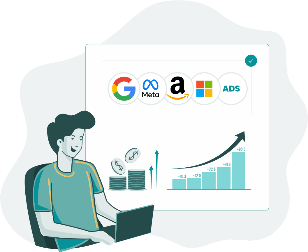
Finally, people need to find your page or it’s useless. Using targeted ads like Google Ads can help drive traffic to your landing pages. But you don’t have to go at it alone. Check out our 14-day free trial to see how Optymzr can supercharge your ad campaign and make your landing page a lead generation machine in no time.