One of the highlights of Optmyzr’s report designer is that you have the option to include multiple date ranges in the same report. For example, when creating a monthly performance report you can include a graph to show how account performance has changed over the last six months. In the same report, you can include data broken down by day for the month.
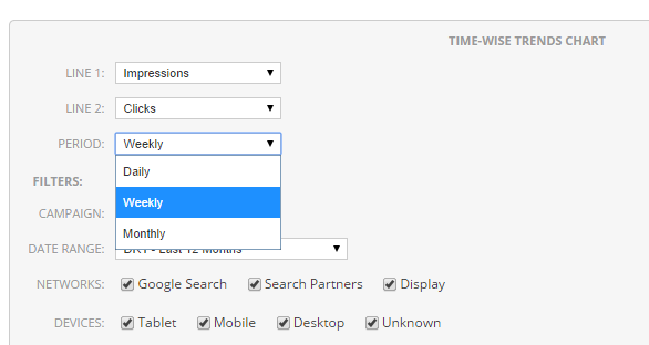
To make it easier to show data for long periods of time, we updated the Time-wise trends chart (earlier daily trends chart) to include an option to specify the time interval. Now you can choose the level at which you want to show the data in the chart – daily, monthly, weekly.
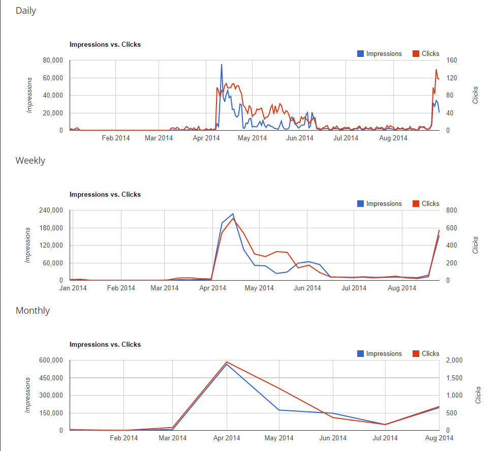
Sometimes data at the daily level can be too noisy to show trends or performance over a longer period of time like three or six months. In this case choosing the option to show data at weekly or monthly level helps.
This is how the different intervals will show up on the chart